Synced Off Planet

Client: NExT Studios
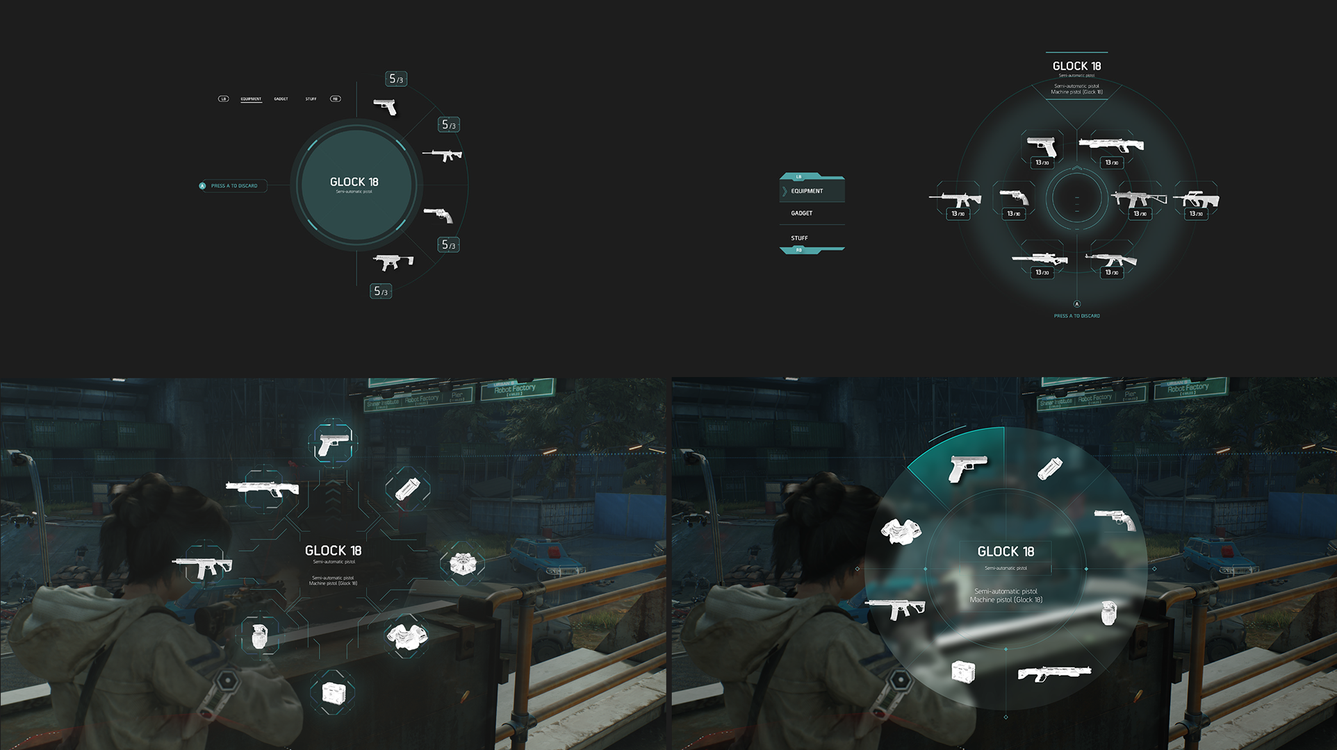
We developed the sci-fi UI design for Synced Off Planet, creating a full style guide for the elements and various screen mocks ups.
HUD Screen

Look Development


Colour Palette

The main brand palette is inspired by nature.
The Human palette reflects the main brand palette, but is a little more saturated to draw attention. It is inspired by nature and military equipment.
We want to make sure Teammates aren’t confused with enemies, so they share a similar area of the colour spectrum to the main player.
The NANO palette is influenced by technology. Digital, artificial light sources, bright warm colours alongside deep dark blues.
As NANOs are the enemy, the colours are inspired by aposematism - bright vibrant colours in nature that signify danger - like poisonous frogs.
UI Elements
Maintaining a visual balance was our priority when creating the UI language. Aiming for the UI to be mostly neutral - and only use bright colour when there is reason for it, to draw the players eye or hint danger is near.
Keeping accessibility in mind and ensuring essential information is not conveyed by colour alone, allowing as many people as possible can enjoy and understand the UI.

D-PAD + STATS
POP UPS


PICK UPS

